|

How I Built This Website
The tools and processes used to create this website have
evolved dramatically since 1995, when I launched it. Here is
a brief description of how it was done, along with some advice
about how to create your own.
Computer Equipment
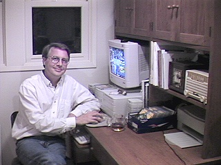
My 1995 computer system seemed pretty hot at the time, but now
even the cheapest discount PC will put it to shame. Here's a
photo from those days, showing me in front of my "blazing"
90mhz Gateway computer. And, yes, that's a box of 5.25-inch floppy
disks on the desk.
I have gone through several computers since then. I currently use an HP laptop.
You don't need an expensive computer to
build a website. What you need is a machine that can
connect to the Internet and do basic text editing and
image processing. A fast machine will process images
faster than a slow one, but there's no web task that I couldn't still do on my 1995 system.
Photography
All of the early photos were taken with my trusty old Nikon FE2 35mm
film camera. Affordable digital cameras were still a dream of
the future in 1995.
After having the photos made into prints, I used a flatbed scanner in the employee library after hours
to convert the images to digital form.
Each digitized photo was then processed using an art program
such as Paint Shop Pro or Photoshop.
I didn't have a fancy photo studio. Here's a view of one of
the earliest setups.
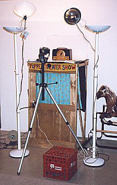
Yes, that's a corner of our kids' playroom at the time. The subject
radio was placed on top of their puppet theater (they painted
the sign, by the way), and I arranged various house lamps and
clip lamps to provide lighting.
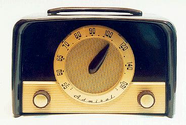
The camera stood on a tripod in front of the radio. The set being photographed is an Admiral 5E22, which
served as the front-page icon for our photo
gallery during
the website's first ten years.
One lesson I quickly learned is that you need to use a blue
filter on a film camera when shooting with daylight film, to
avoid too much yellow in the resulting image. Modern digital
cameras typically have adjustments to prevent such problems.
You can also adjust the color balance with an art program
in post-processing.
In subsequent years, I have used a variety of other film and digital
cameras. Nowadays I alternate between a Nikon Coolpix and Panasonic Lumix.
Their resolution is more than
adequate for web pages and I love the convenience of
snapping a few pics with the camera, sticking the
memory card into the computer's card reader, and immediately
seeing how they'll look on the screen.
For a gallery, photograph your radios against a plain background.
I made a large white background by taping together some large
pieces of thin white poster board. If you lay the photo board down on a
table next to a wall, you can bend it so that half is on the
table and the other half sits up behind the radio. The gradual
bend in the flexible board where the table meets the wall allows
you take a photo with an "invisible" background.
I have a few pieces of plain
fabric that I use for other photos, depending on the color of
the subject. If you think the background color doesn't matter,
try photographing the same radio against a white, medium gray,
and black background. Your automatic camera (virtually all contemporary
cameras are automatic) may adjust settings
so that one background gives a better result than others.
Lighting is an art unto itself. My first piece of advice is
to avoid using your camera's flash at all costs. Flash lighting
creates glare and unnatural shadows. You'll get much better
results by turning off the flash and using either natural
light or supplemental indoor lights.
If you're working indoors,
try setting up in a room with the best possible natural light.
You will usually need two or more supplementary lamps to
evenly light the radio all the way around.
Put your camera on a tripod and be careful to align it with
the subject to avoid unwanted effects such as skewing.
If you don't want to mess with lights and backgrounds, try
bringing your radio outdoors. Natural light can be wonderful.
I have gotten the best outdoor shots by putting the radio
in "bright shade," for example, on the north side
of a house where there is plenty of ambient light but no
harsh sunlight or shadows.
Image Processing
No matter how you acquire the digital image, it will benefit from some tweaks before you incorporate it into a web page.
I use either Paint Shop Pro or Photoshop for this work.
In addition to cropping and sizing, most images in this
website have had some adjustments for brightness,
contrast, color balance, sharpness, and so on. The goal
is not to make the image look "better than real,"
but simply to reflect what the radio
really looks like.
Most of the images in this website are saved in .JPG format,
which offers good compression (resulting in small, quick-to-load
files) without sacrificing too much image quality. I also use
.GIF format, especially for black and white images or where
I want a transparent image background. Large documents are
created in .PDF format.
Even though many people now have high-speed Internet
connections, it's a good idea to use a compression factor
when saving image files, sufficient that the images will
load quickly. Most of my pages also offer "thumbnails"
of all the photos, so that the page itself will load quickly,
and then people can click on the thumbnail to view a larger
version of the image.
If you use consistent images sizes throughout your site,
that will simplify any future site-wide changes.
HTML Editing and Validation
When I began work in 1994, there was no such thing as a
WYSIWYG ("what you see is what you get") HTML editor
or website manager. I wrote the first webpages as raw text
files using DOS Edit or Windows Notepad as my text editor.
Over the course of the next ten-plus years, I tried out a variety of
WYSIWYG HTML editors, both at home and in my "day job," which
involved publishing of very large reference documents in HTML as well as in print.
If I were creating a large website from scratch nowadays,
I would use something like Microsoft Front Page, which includes
site management tools in addition to editing facilities.
I still use Notepad for everyday website editing. It's a
simple, quick editor, and since I already understand HTML,
I don't need anything fancier.
You can also use Microsoft Word to compose your page visually
and then save the document as HTML. This is convenient. Be
aware, however, that Word inserts a large amount of extra HTML code,
compared to a hand-written page, so your document may be
confusing to edit later on, if you are dealing with the native
HTML code. In that case, it's an advantage to have hand-written
HTML with a minimum of superfluous coding.
Although I don't use Word as my primary HTML editor, I do use its
grammar and spelling checkers on every file. After noting any corrections,
I close Word and make the edits in Notepad.
There are many online resources that will help you learn how
to write web pages in HTML. The World Wide Web Consortium has
a good Getting
Started page.
It's a good idea to run your HTML page through a checker to
ensure that its coding is valid and will display reasonably well on
different browsers. Every page on my website has been validated
using the World Wide Web Consortium's free
validation service.

An HTML validator tests for proper coding but it doesn't check your page's
links. You can do that with W3C's free
link validator.
In addition to grammar/spell checking and HTML validation, it's
important to test your website using at least a few of the available
browsers. Before posting any new page to the Web, I view it locally
using Microsoft Internet Explorer and a couple of others such as
Google Chrome.
The various browsers look very similar when displaying a plain-vanilla HTML
page, but differences are noticeable for a page that's very complex or
which diverges from W3C-approved coding.
My website has undergone a couple of major redesigns over the years, to improve
the visual appearance and reorganize (in most cases, simplify) its navigational structure.
If your website contains more than one page, you'll find it very beneficial
to make all of the pages as consistent as possible. Someday, sooner or later,
you will want to update your site in some fashion. If the internal coding
and external design of your pages are all different, this can make the
update very tedious.
At this point, I have regularized the internal format of my
hundreds of HTML files, so that I can implement site-wide changes through a
mass search-and-replace action.
Website Design
The best advice I can give is to keep it simple!
Beginners are
often tempted to load up their web pages with too many graphics,
animations, fancy scripts, and other bells and whistles. This
can make your website hard to maintain, and annoying for
visitors who are simply looking for a piece of information.
The most common beginner's mistake is to put everything
into a single, gigantic page. If your page contains too
many pictures, it will take forever to load. Some
visitors may get impatient and leave in frustration
before viewing your content. An unnecessarily large page
also dissuades people from printing it. Perhaps someone wants to print
only a few interesting paragraphs or a couple of photos for
reference. That would be easy and quick if that content were
on its own page, but not if you have to make a 50-page printout
just to get those few items.
A well-designed website will divide different pieces of
content into separate HTML pages, with links between
them to allow visitors to quickly navigate to points
of interest.
Begin with a simple, straightforward organization that
is easy to navigate. If people can't find their way around
your website, then you have wasted your time writing a bunch
of pages that nobody will ever see.
Organize your content logically. If you go to my
home page, you'll see how
this site is organized. There is one section for
the photo gallery,
another for general information
sources, another for building
projects, and so on.
Navigational aids are very important. The high-level
pages in this site have a table of contents on the left,
showing all the major areas. Lower-level pages have
a little navigation bar at the top that shows where
you are located within the site. The page you are reading now has a
navigation bar showing that it's part of the
Features section, which is one level below the home page.
Such navigational aids are especially important now because
of the widespread use of search engines such as Google.
When I launched this site, people
found new websites primarily by surfing—following
a trail that led from one link to another, and one site
to another. For example, someone who was curious
about the Hallicrafters model SX-28 radio might
have started at the home page,
then clicked on the Gallery,
then clicked on Communications,
then clicked on Hallicrafters SX-28.
Nowadays, many people start with a
search. Our hypothetical visitor may search for
"Hallicrafters SX-28" on Google and go directly
to that page rather than tunnel down through the hierarchy.
The navigation bar at the top of my page shows the visitor
that this page is not the only one in the website. It is
part of a section named Communications, which in turn is
part of a Gallery, and so on.
The statistical logs for my site illustrate this dramatically.
During the first year, I kept a "hit counter"
on the home page, which incremented every time somebody
visited that page. By the time I retired the counter, it had recorded more
than one million hits, which may seem like a big number. But the
true number was much larger. During recent years, this
site has consistently received several thousand
separate visitors per day.
Nowadays, the majority of visits begin with a search and
direct the visitor to a specific page within this site, not
to my home page. This underscores the importance of
providing clear navigational aids on every page of your site,
so that a visitor who lands at Page X can see that's there more
which might be of interest.
Once your site is up and running, it's instructive to look at
its statistics. They will tell you which pages are most often
visited, how long each visit lasts, how many pages were
visited in that session, and so on. By analyzing this data,
you can get a sense whether your website's organization is
helping people find what they're looking for.
In addition to its visible organization, your website will
have a physical directory structure on the web server. I prefer what
is called a "flat" directory structure. All of my hundreds
of HTML pages are stored in a single directory. My thousands
of image files are stored in a single subdirectory named "art."
This structure simplifies your links and website management.
For example, in my web pages, most IMG SRC tags to display
a picture look something like this:
src="art/RCACTC-4TunerCleaned.jpg"
If I revise the visible appearance of my website, I
don't have to change all of the links that point to my
image files. They are all located in "art."
If you use descriptive names for your image files and HTML
files, it will still be easy to locate them within these
large directories. In the early days, I used old-fashioned filenames
like "halli0901.jpg." Nowadays, I use more
descriptive names such as "RCACT-100RefinishedCabinetRear.jpg."
Speaking of filenames, keep in mind that case matters. The big computers
that host websites usually run the Unix operating system. When you
are building a website, it's typical to create the files and test their
links on your home computer, which might be running, say, Windows. If your
web page has a link to an image file named Image.jpg, that link will work in Windows
whether the file is named Image.jpg, image.jpg, image.JPG, or ImAgE.JpG, because
Windows doesn't care about the case of the names when looking at local files. To the Unix
web server, however, those are four separate files. Thus, if your web page links to
a file named Image.jpg, but that file is actually called image.JPG, the link will
work locally under Windows but fail when you upload the files to your website on the Unix server.
|